Friday, December 19, 2014

project 4

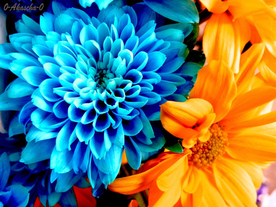
I decided to put 2 of the same flowers together and have one with enhanced colors.
Diptych 1


I chose this diptych of a leaf with different color balances.
diptych 2


I chose this triptych of 2 pathways to make it look like the same one.
triptych 1


I took the trunks of 3 separate trees to make it look old and rotted looking.
triptych 2
this kaleidoscope reminds me of Mt. Hood in a ghostly apparition on a lake.
kaleidoscope 1 


I thought that this specific kaleidoscope looked especially unique because it makes you feel like your in a tight alley way looking up.
kaleidoscope 2


I did this kaleidoscope of an originally red car and turned it purple, this specific one looks like 2 cars joining to become 1
kaleidoscope 3


Monday, December 8, 2014

Edited Pictures

I brought the saturation and luminance of the red up to give it more of a lovey feeling and I brought the hue of the orange down to make it more of a pink color.


I completely brought down the saturation and luminance of the green leaves in the background so the focus would be on the flower itself. I also played around with the orange, red, and yellow saturation and hue to turn this originally yellowish white flower into a dark/light pink flower.

Wednesday, November 26, 2014


Photo with a strong contrast in scale. 
Bill Plympton


Photo with a strong contrast in color.
Nicole Galvin

Photo with a strong contrast in texture.
Allan Peterson


 Photo that is symmetrically balanced.
Jos Kuklewski

Photo that has radial balance.
Jonatas Cunha


Monday, November 17, 2014

I decided to use this picture of the sunset outside of my house as cool colors because of the light blues and oranges which to me seem to be cold and calming colors. 

I wasn't quite sure whether this was a heating lamp of just a red light but i wanted to use this picture as warm colors and bring down the saturation and hue of the red to make it look darker.

This rose or any rose always catches my eye. At first it was a white rose, but with some tweaking I was able to turn it pink. It then became my color compliments.

This picture of a construction zone sign (surprising) with a cool geometric pattern and bright orange feel brought me to the conclusion of using it as my monochrome picture.

Wednesday, October 29, 2014


I felt that this picture showed/set a feeling of calmness and serenity, because of the light subtle colors of the sunset and the grayish blue of the ocean. I thought the use of a darkened frame was a great choice because it makes the eye focus on little details such as the shading of the waves.
 

Monday, September 22, 2014

project 1


                   I took this picture of a lock on the bridge over a highway and decided to edit it with a drama 2 brightness, vintage 1 with full strength and full vignette.


                      I took this picture of the metal chessboard from Pioneer Square and just added a black and white shading with detail.
           
                 
                    I took this picture of one of the bear statues by the Pioneer Square Mall. I added HDR scape Preset 5, Details, and Vintage 3.

Thursday, September 11, 2014

My Summer

I didn't do a whole lot this summer, but the one thing I am really looking forward to this October is going on a one week vacation to Seaworld, Universal Studios, and most importantly......DISNEYLAND!!!!!!